
UC geography professor creates a new map to examine climate change anywhere in the world.
What does Salt Lake City have in common with Tehran?
More than you might think, if you’re a climate scientist.
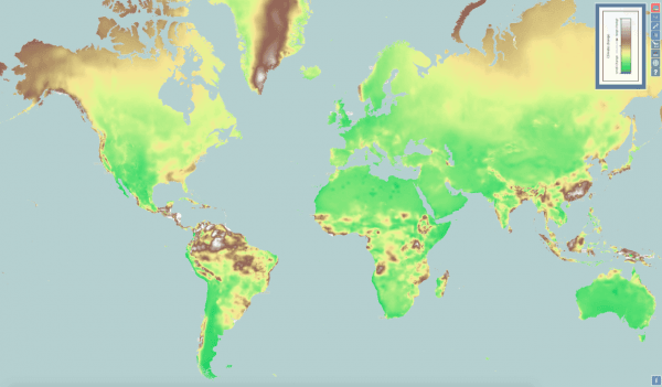
University of Cincinnati geography professor Tomasz Stepinski created a new interactive map that allows students or researchers to compare the climates of places anywhere in the world. The map draws on five decades of public meteorological data recorded from 50,000 international weather stations around the Earth.
The data, gathered by WorldClim, is mapped in a 4-square-kilometer grid that gives researchers a visual of what’s happening with temperatures and precipitation from pole to pole.
“The map demonstrates climate change over time but also climate diversity. The concept is powerful and can inspire a lot of research,” Stepinski said.
Continue reading at University of Cincinnati
Image via Joseph Fuqua II, University of Cincinnati