Such detailed maps could help policymakers choose the most effective ways of cutting carbon emissions.
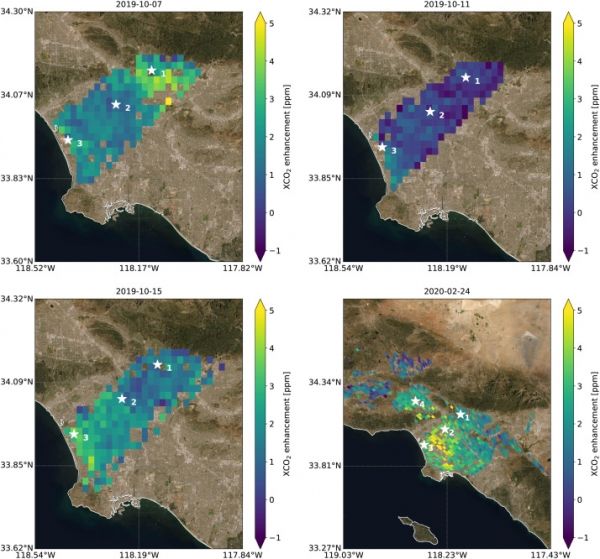
Using data from NASA’s Orbiting Carbon Observatory 3 (OCO-3) instrument on the International Space Station, researchers have released one of the most accurate maps ever made from space of the human influence on carbon dioxide (CO2) in the Los Angeles metropolitan area. The map shows tiny variations in airborne CO2 from one mile of the giant L.A. Basin to the next.
The highest CO2 readings, in yellow on the map, are on the west side of downtown L.A. – a densely populated area with congested freeways and CO2-emitting industries. Yellow indicates atmospheric CO2 elevated by five or more molecules out of every million molecules of air, or five parts per million. That’s equivalent to the amount that global atmospheric CO2 is rising globally on average every two years
The animation shows five adjoining swaths of data the OCO-3 instrument collected over the metropolitan area to create a map of CO2 concentrations that covers about 50 square miles (80 square kilometers). Each pixel is about 1.3 miles (2.2 kilometers); the color indicates how much higher the concentration of CO2 is in that spot than in clean desert air north of the city (measured at NASA’s Armstrong Research Center, upper right).
Continue reading at NASA Jet Propulsion Laboratory
Image via Remote Sensing of Environment